
I worked at Nationwide for eighteen months and was a part of a three-person Experience Design team for the savings account applications. The flow we designed caters for a range of savings products, including ISAs and bonds, and covers additional features such as funding, one-time passcode and identity verification.
To ensure consistent implementation, my team created and maintained a UX pattern library that documents the usability principles shared across all application forms at Nationwide.
Nationwide was the first UK provider to launch an Internet banking service in May 1997. In the decades that followed, its digital ecosystem grew and evolved organically to include multiple channels created and maintained autonomously.
The resulting inconsistencies meant users had to continuously learn how to interact with our products, which increased cognitive load, reduced efficiency and undermined trust. It also meant that product teams were repeatedly solving the same problems, which hindered performance and slowed down innovation.
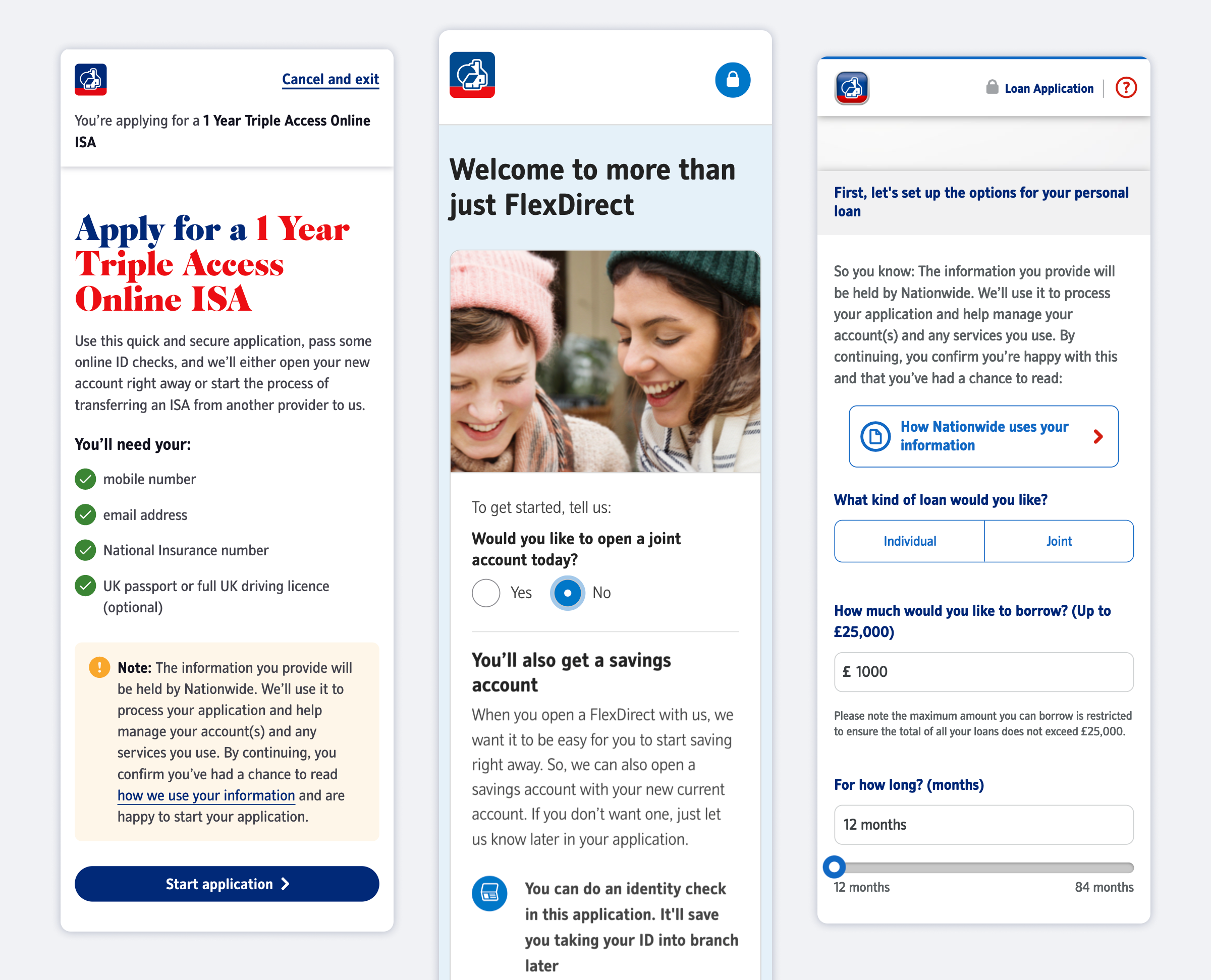
The opening pages for the current account, savings account, and credit card or loan application are inconsistent and show evidence of independent design decisions that have not been aligned.
This challenge was partially addressed by the Nationwide Experience Language (NEL) design system, which consists of a library of UI elements accompanied by a style guide. Referencing the Atomic Design framework, NEL is a collection of atoms and molecules, but it lacks guidance for how these should assemble into organisms and be used as product templates.
To address this gap, my team created a UX pattern library that documents the usability principles for application form design at Nationwide.
From writing a proposal and getting stakeholder buy-in, to defining the scope and implementing the solution, I led on the creation of the UX pattern library. Working closely with both a UI and a content designer on my team, I identified and prioritised patterns and defined the usability principles that guide their implementation. I facilitated a two-day in-person workshop with the project team, synthesised research, created templates and set up and maintained the library going forward.
To begin with, my team gathered visual references for all existing application forms in savings, as well as some in current accounts and loans. By defining the purpose of each interaction, we were able to break them into individual building blocks that informed the structure of the future pattern library.

Full savings account application flow with annotations on design improvements and inconsistencies
Some patterns corresponded to pages, like application or funding outcome screens. Others consisted of multiple steps, like gathering applicant’s personal details, while some were overarching principles such as errors, warning and timeouts that could take many shapes and occur at different points in the journey.
Some design patterns, like a transfer of an ISA, consisted of multiple screens. These, in turn, followed individual templates, such as summary pages or outcomes, which had to be aligned across multiple design patterns.
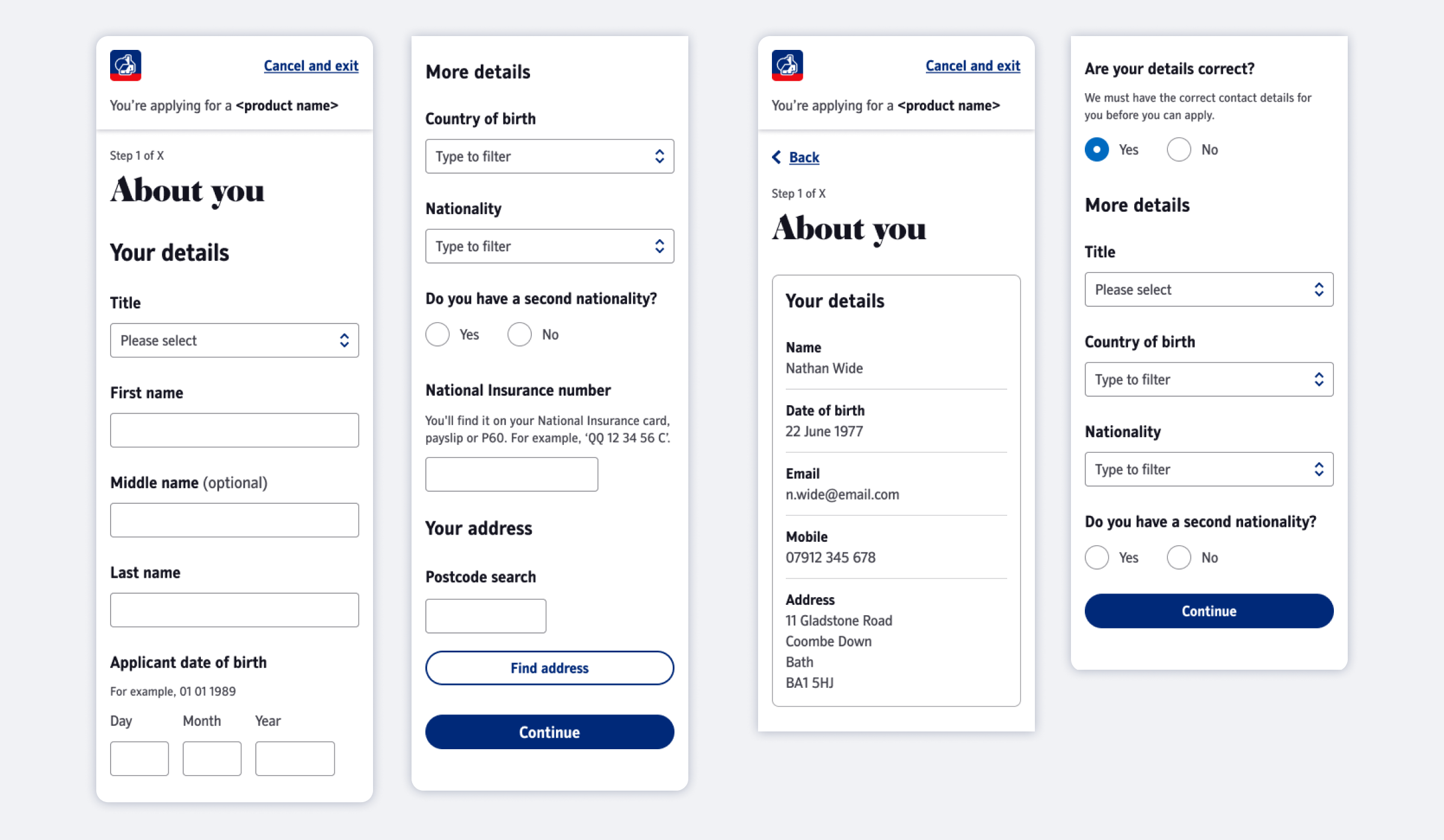
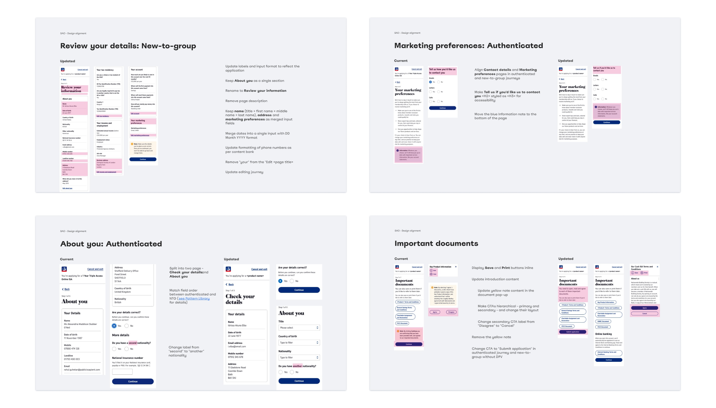
Several patterns had design variations between different savings products (e.g. ISA vs bond) or the application type. This is what the personal details page looks like for new vs authenticated users.
After defining the purpose of each pattern, my team did extensive competitor research, gathering and reviewing instances of similar behaviour from direct competitors as well as broader industry.

When working on the digital ID verification flow, we gathered extensive competitor references for each step. Here are seven examples of image or video capture instructions from a range of service providers.
My team held a two-day future state workshop to review and prioritise work. On day one, I facilitated three exercises inspired by the Collaborative Product Design book:
Goal mapping: brainstorming, discussing and prioritising product and project goals.
Future vision: identifying current state successes and pain points and defining what future success looks like.
Pattern review: discussing and aligning on the purpose, features and constraints of each of the proposed UX patterns.
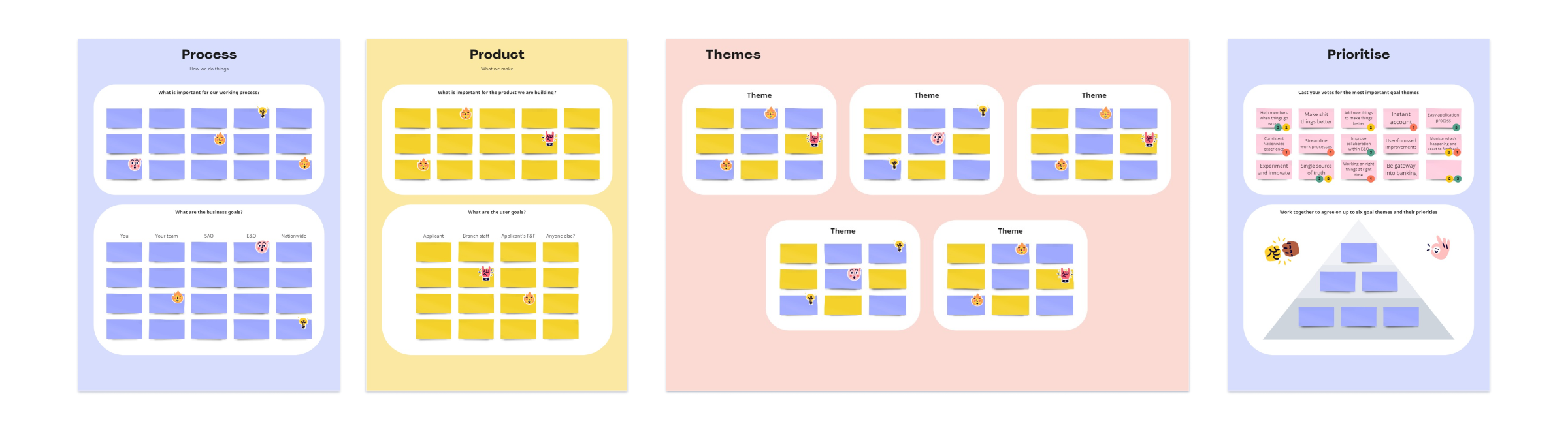
Workshop setup for the three-step goal mapping exercises
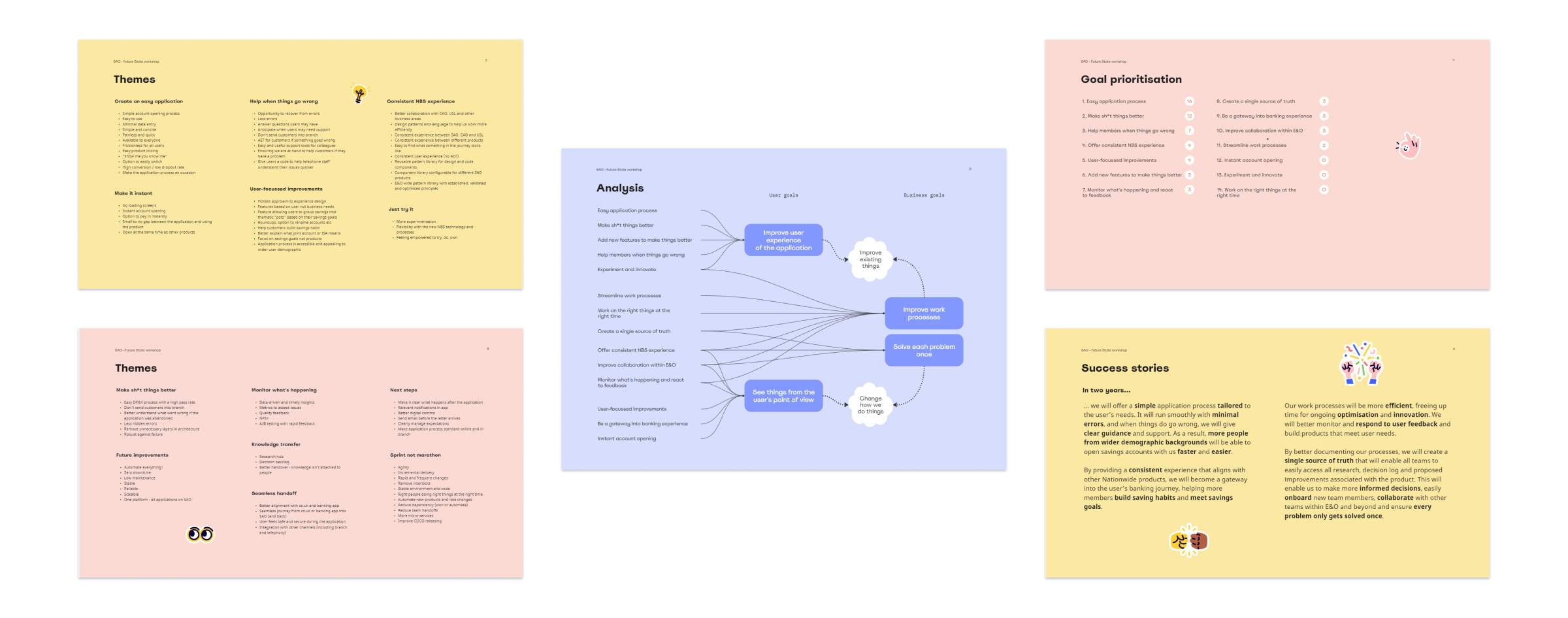
Selected pages from the final workshop report
Having synthesised the workshop findings, my team was ready to start building the pattern library. We knew the current and target state for each pattern, its underlying principles and technical constraints.
I set up a Confluence template which covers the overall purpose and functionality of each pattern before listing all instances. These have individual descriptions, a list of usability principles, notes on accessibility, task flow references, content bank links and embedded Figma frames.
Over the next three months, the Experience Design team worked to populate the template for each pattern and review the proposed changes principles with the wider product team.
Inevitably, this work highlighted the gap between the current and target states. To bridge it, I wrote a detailed report listing and explaining the proposed changes for each pattern. To enable front-end teams to pick up these tasks on an ad hoc basis, I set up a worksheet that helped us collectively track, categorise and prioritise the proposed changes. I also organised fortnightly meetings to discuss, review and sign off the work. To find out more, take a look at my article on best practices for managing design debt.
Selected pages from the design debt report
In an organisation of this size, change takes time. Even a seemingly simple task of aligning user experience within a single form comes with many challenges, and expanding the scope to involve other teams requires a gradual shift to a more open and collaborative working process.
Nonetheless, the work that has gone into creation of the UX pattern library helped align our team’s vision for the product we are creating. It clearly showed the gaps in our thinking, highlighted inconsistencies and gave us a solid starting point to innovate from. Instead of reinventing the wheel each time a new challenge comes up, the team has a shared reference they co-created, meaning we achieved one of our main objectives: don’t solve the same problem twice.